.png)

Design System
crouton - A Design System for Sweetgreen
A component library, token system, and documentation built to bring consistency to Sweetgreen's online platform.
Team
Roshni · May · Keertana · Joanne
My Role
UX Design
Tools
Figma · Zeroheight · Atomic Design
Timeline
September – December 2025
01

Project Overview

Does Sweetgreen Need a Design System?
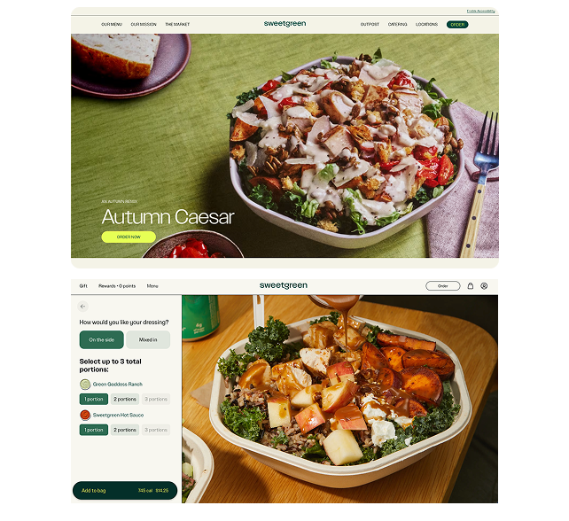
Sweetgreen is a fast-casual salad brand with 240+ locations and a clear brand identity in the real world. Online, that clarity was harder to find.
Fonts, colors, and layouts varied so much that moving through the site felt like visiting different websites under the same url. Buttons looked different across pages. The footer changed depending on where you were. Navigation shifted or disappeared between pages. The site worked,but it felt inconsistent and difficult to scale.

.png)
Problem 1
Inconsistent UI across pages, with no shared button, card, or link styles
Problem 2
Four different footer layouts and inconsistent navigation patterns across the site
Problem 3
No standard styles for type, colors, and spacing, hard to maintain and lacking consistency
✦
Our Goal
Standardize core UI components with documented usage rules
✦
Our Goal
Define a single global nav and footer template
✦
Our Goal
Build a token system to support consistency and scalability
02
Our Process
How We Approached It
Phase 01
Audit: Deconstructing the system
We collected screenshots across 8 pages of the website and catalogued components by atoms, molecules, and organisms, documenting inconsistencies and accessibility issues.
Phase 02
Tokens & UI Kit
We standardized components, defined states, and built a token system for color, typography, and spacing. Flexibility for future growth was a priority throughout.
Phase 03
Documentation
We published everything in ZeroHeight, documenting rules and guidelines for component usage, creating a single reference for designers, developers, and cross-functional collaboration
03
Audit Findings
What the Audit Revealed
Components varied across every page:
The audit surfaced dozens of component variations with no consistent logic. Buttons, cards, and links behaved differently depending on where you were on the site. Accessibility gaps were present throughout.
✦
OUR SOLUTION
.png)
No consistent navigation and footer:
Certain pages used their own navigation patterns. Four different header and footer layouts existed across the site, weakening both usability and brand perception.
✦
OUR SOLUTION
Inconsistent fonts and colors:
Type color and spacing followed no clear rules. Various shades of green and beige were used throughout the site each with differing hex codes. Without a consistency and shared system, pages looked entirely different, undermining any sense of brand cohesion across the website.
✦
OUR SOLUTION
.png)
04
OUR DESIGN SYSTEM
Building crouton
Crouton covers tokens, components, and documentation. It gives design and development a shared foundation to build from consistently.

.png)
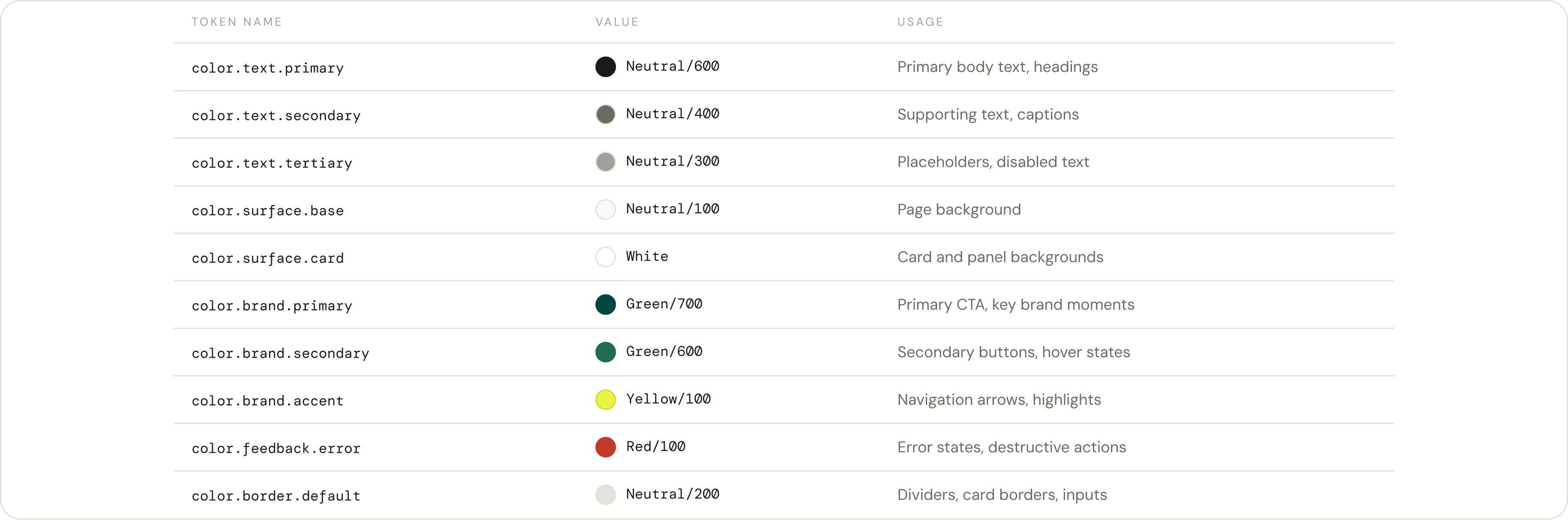
Tokenizing the system
Tokens are named values for colors, spacing, and type. Rather than hard-coding #00473D into every component, design and dev both reference color.brand.primary. One change updates everywhere that token is used. For a site where each page was making its own visual decisions, this makes consistency easy and scalable.
Color Pallete
.png)
Semantic Color Tokens
Spacing Tokens
.png)
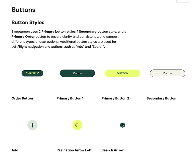
UI Kit: A consistent button style, global nav and footer
.png)

05
Documentation
Creating Documentation in Zeroheight
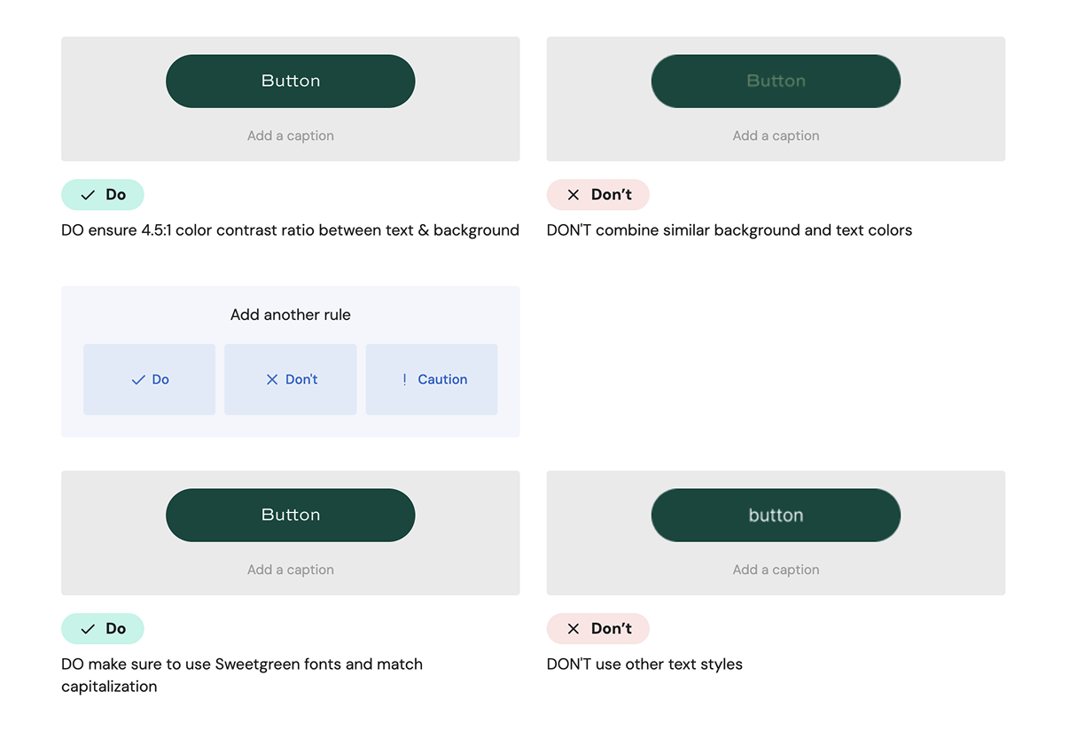
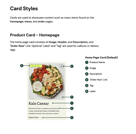
We documented Crouton in ZeroHeight, covering foundational styles, component anatomy, accessibility guidelines, and resources for designers and developers. We created rules and exceptions to help simplify design decisions and support scalability and consistency for designs of new pages and web experiences. It serves as a foundational reference and single source of truth for design and development.
Thanks for reading!