UX Research · Eye-Tracking · Redesign
What Eye-Tracking Revealed About the
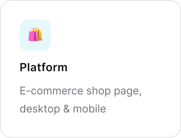
Hooked on Phonics Shop Page
A deep dive into how real users browse, scan, and struggle: uncovering research-backed
opportunities to modernize an e-commerce experience
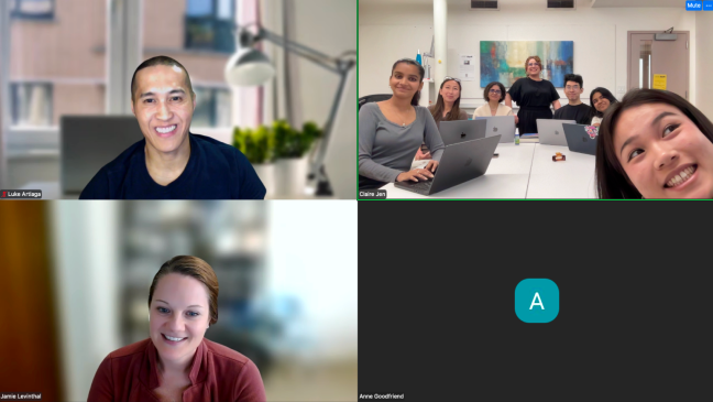
Team
Maanya · Krishna · Joanne
My Role
UX Research, UX Design
Tools
Figma · Tobii Eye-Tracking · VWO
Timeline
October – December 2025
01

Project OVerview
The Brief
Hooked on phonics is an e-commerce brand selling educational products such as literacy, math, and spelling kits for school-aged children, Their Shop page is a primary landing page for traffic from email marketing, paid ads, and organic search.
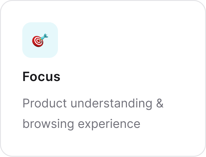
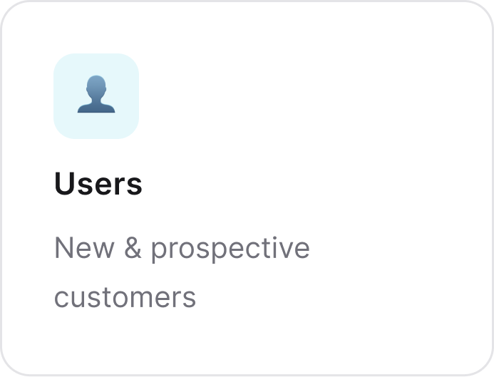
The page hasn't seen a major update in years. Our team was tasked with researching product understanding on the Shop page across both desktop and mobile platforms, focusing on new and prospective customers
02
Defining the problem
So.. Where Do We Start?
The Shop page houses a mixed range of products - math, spelling, reading packs, subscriptions, workbooks, and learning kits- all in one place, without clear categorization or visual hierarchy to help users navigate.
A quick audit surfaced initial hypotheses that we were interested to investigate:
• Key product information hidden within dense product details
• Features like the hamburger menu & preview button potentially missed
• Category options insufficient for efficient browsing
How Might We
"How might we optimize product understanding to improve the browsing and shopping experience on the Hooked on Phonics Shop page?"
Research Questions
Exploring & Browsing
What are users’ first impressions of the shop page? How do they explore and understand the range of products?
How do users find a specific product based on different categories ( age, product type) ?
Product Distinction & Evaluation
How do users compare between two products, learn about the product, and choose one to purchase?
03
Research Methods
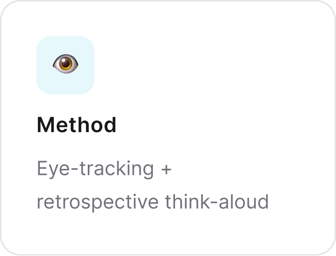
Conducting Eye-Tracking Studies
Participants were recruited via Pratt's platform Private Panels.
Sessions combined Tobii Pro Lab eye-tracking with retrospective think-aloud sessions to understand how users interact with and perceive the Shop Page. Our main goal was to uncover research-backed opportunities for improving the shopping experience on the site.
After sessions, we documented quotes and observations in a
Rainbow Sheet, then used affinity mapping to synthesize
findings before translating them into actionable insights.
Findings were cross-referenced with VWO data analytics. We looked at scroll maps, heatmaps, and click data to validate observations and strengthen recommendations
👁️
Tobii Eye-Tracking
We captured gaze data as participants walked through tasks on the website, revealing where attention landed, and what was missed
💬
Retrospective Think-Aloud
Post-session interviews added qualitative depth by providing context into the why's behind users' interactions.
📊
VWO Analytics
Cross-referenced scroll maps, heat maps, and click data to validate findings through a mixed-methods approach
04
Key Findings & Recommendations
So.. What Did Our Research Reveal?
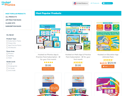
Finding 01
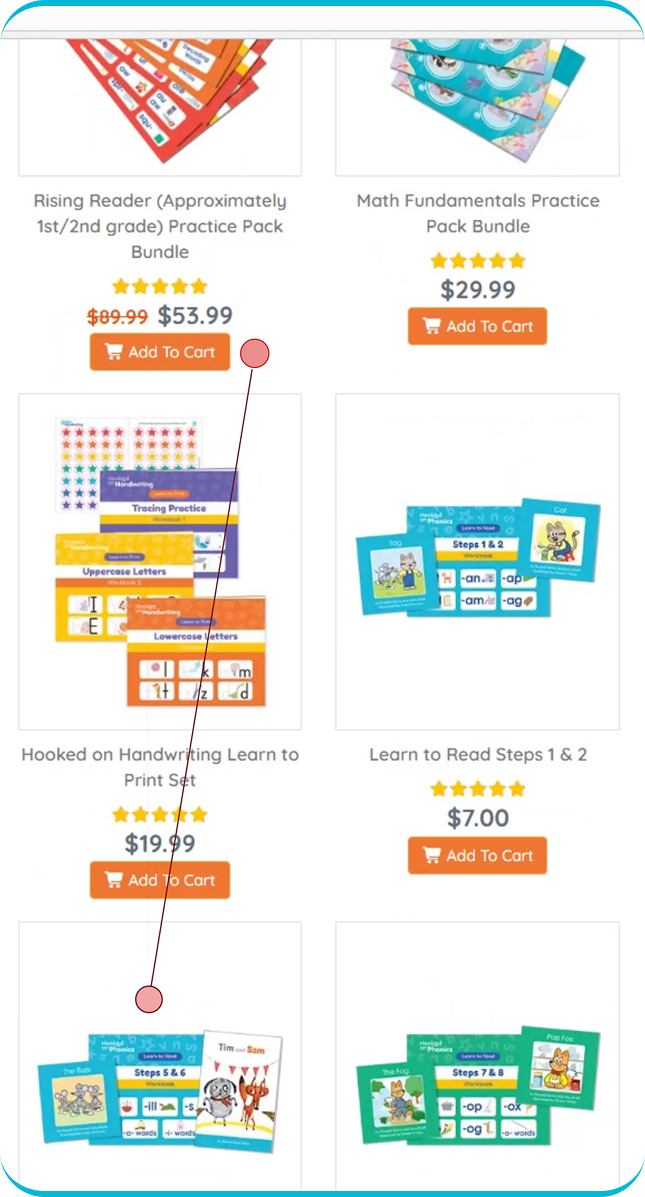
Product titles were too long and lacked visual distinction:
Product cards combined product type, name, and age range into one undifferentiated title. With no clear hierarchy, participants relied almost entirely on product images to identify and compare items.
"The product names were too similar... I was seeing 'Learn to Read' everywhere and it was hard to see the age."
— Participant 1
✦
OUR Recommendation
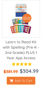
Before
• Type, name & image are one long title
• No visual hiearchy between elements
• Users struggled to scan and compare ⤵
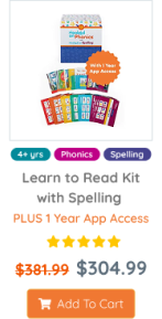
After
• Name and product type visually separated
• Color-coded age & type tags
• Special offers are called out with color ⤵
Finding 02
Current categorization was insufficient for navigating to a specific product:
"The filters are only for grades. I think they could also have something for spelling, for reading or math. They should separate these."
— Participant 5
Before
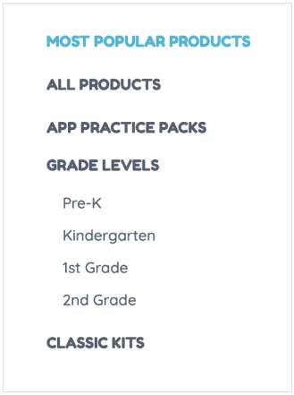
After
✦
OUR Recommendation

Finding 03
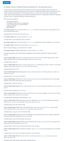
Product descriptions were dense and hard to scan:
Online shoppers rarely read dense descriptions and our gaze data confirmed this. Most users skimmed bolded headings rather than reading full paragraphs. Long, unbroken text made it difficult to quickly understand what a product actually offered.
"It's unclear what the product is until I read this, and I genuinely don't have time to read all this, to be very honest."
— Participant 3
Before
• Dense wall-of-text product descriptions
• No information hierarchy or scannability
• Key details buried mid-paragraph ⤵
After
✦
Recommendation
Introduce clearer headings and divide content into scannable tabs. Condense key information, improve hierarchy with bold titles and color, and separate sections into clickable tabs to break up the information
• Content divided into clickable tabs
• Bold titles + color to surface key info within the first viewport
• Condensed, scannable structure that makes information more scannable without losing SEO value ⤵

05
Outcome
Outcome
Our team presented findings and recommendations to the team at
Hooked on Phonics, who responded positively, expressing appreciation
The client noted that the data and recommendations closely aligned with their own initial assumptions. We were happy for the opportunity to support their efforts to modernize the website.
Thanks for reading!